
How to Design a Lead Magnet That Will Engage Readers From the Get Go
You may not have realized it yet, but your lead magnet design affects its conversions too.
In fact, whether someone will want to engage with your company after reading your eBook or content upgrade will largely depend on the information it contains BUT ALSO, on how you’ve presented it.
So far, I’ve shown you various strategies to improve your lead magnet’s content, drive more traffic to it, and boost its downloads.
I think it’s about time we look at how you could make your lead magnet more visually appealing.
So, in this post, I’ll show you a couple of design tricks that will help you boost your lead magnet’s engagement.
Intrigued what they are? Then all you need to do is keep on reading.
#1. Use Higher Contrast When Styling Links in the Content to Boost CTR
Look, I’m sure this goes without saying:
If readers won’t notice a link inside the content, then there’s absolutely no chance that they’ll click it.
And yet, how often do you style links with branded colors which often make them indistinguishable from the rest of the copy?
Here’s a quick example of what I mean (note: the below is only a mockup I created with Beacon using one of our templates).
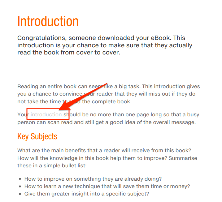
Although I set the link in a different color, the contrast between it and the other copy isn’t strong enough to make it distinguishable.
Now, take a look at the same page with a link set in a contrasting color…
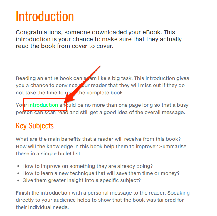
The difference is striking, isn’t it?
Now, of course, you don’t have to use such extreme colors. But at least, try to pick ones that stand out from your brand.
How do you find your brand’s contrasting colors?
It’s actually quite simple. Use Adobe’s Color Wheel (you can find it here).
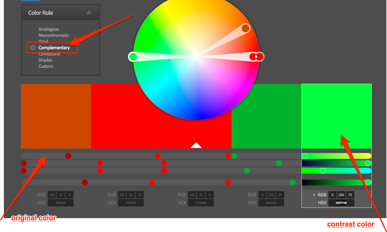
First, select Complementary colors from the Color Rule box.
Then, set your original, branded color in the leftmost box.
Hit enter and the software will find its four complimentary colors. I typically use the rightmost one but you might whatever another color on the list works with your design.
#2. Select an Engaging Visual for the Front Cover to Convince More Visitors to Grab It
First impressions matter. And that’s equally true for interpersonal relationships as it is for lead generation.
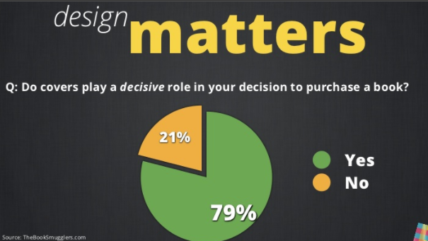
If your visitors don’t engage with your eBook’s cover, your chances of convincing them actually to get it will diminish.
Let me prove that with an example from the publishing business. According to the data from TheBookSmugglers (source), 79% of readers admit that book covers play a decisive role in their decision to purchase a book.
Similarly, academic research showed that “a product’s package has a significant impact on perceived quality, especially when consumers are not familiar with the brand.” (source)
We also know that packaging affects customers on the subconscious level:
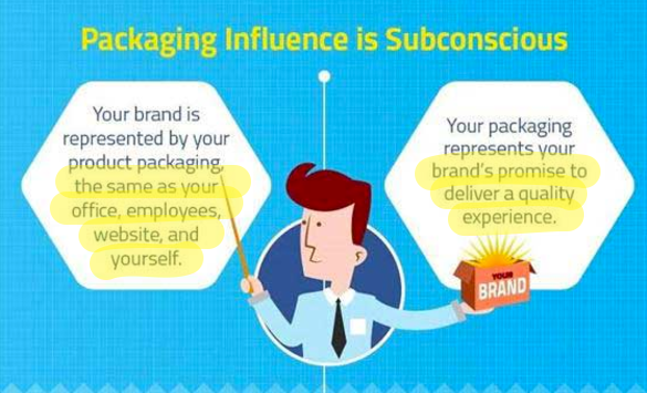
All this suggest that to convince visitors to download your eBook, you’ll also need an engaging cover.
Simply.
How to select the best stock photo for your cover.
Most eBook covers feature a photo or a similar graphic. And that’s no surprise. After all, they’re the simplest visual types to find and use.
But how do you select the most effective photograph to use on the cover?
I actually wrote an extensive guide to using stock photos in lead magnets a couple of months ago. Go through it to find out how to pick and make the most the most of the stock photos.
#3. Add Animated Gifs to Bring Back Your Reader’s Attention
This is a strategy I’ve been using regularly, both in lead magnets and other forms of content.
It works. Quite well in fact.
You see, it doesn’t matter how long or short your lead magnet is, your reader’s attention span will eventually wane as they read it.
Although the below visual illustrates how a person’s attention span changes during a lecture, I’m sure the behavior isn’t different while reading.
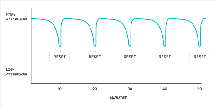
Luckily, you can reset it, and bring your readers back to focusing on your information.
Here’s how I do it – I use the element of surprise.
You see, when we’re surprised or shocked, our brains release noradrenaline, a hormone responsible for concentration, into our bodies.
As a result, we immediately begin to pay more attention to not only the thing that’s surprised us but anything else that’s happening around us.
Here’s how I surprise my readers – I place animated gifs that help emotionally represent what I feel the reader should feel while consuming the copy.
First of all, visuals attract reader’s attention more than text. I can be almost sure that anyone reading my content will at least notice the gif.
Also, they provide a little entertainment, releasing the tension of consuming the information.
All while being a surprising element on the page.

Where to find animated gifs for your lead magnets?
I use Giphy.com, a website that allows you to search for gifs by keywords or phrases and then download them to use in your content.
Final Thoughts
Fact: Design affects your lead magnet conversion rate as much as the information you’ve put into it. From the front cover image that will either attract or deter a person from downloading your lead magnet to colors and visuals, you use throughout, how you present your information will determine what a person thinks of you after they’re done with the eBook.