4 Common Lead Magnet Design Mistakes (And How To Fix Them)
Over the years I’ve designed thousands of lead magnets. Comes with the territory when you run a lead magnet company I suppose! Recently I’ve been redesigning lead magnets for people and there are some common mistakes that keep cropping up. In this article I’ll share what these mistakes are, why they’re a problem and what you can do to fix them.
Bonus – if you read to the end I have a special shortcut that should be the secret weapon in every lead magnet arsenal.
Here are the most common mistakes that I see people make when it comes to lead magnet design:
1. Pixelated Images
I get it – you love this image, it’s perfect for your lead magnet and you don’t want to consider using another. But it’s pixelated. Pixelated images are usually the result of small images made larger. I see this most often when people take their profile picture from LinkedIn and used it as a full page image in an eBook. You might think that people don’t notice pixelated images but honestly it just screams unprofessional.
Design plays a huge role in the credibility of your content. If your content looks unprofessional then people perceive it as such.
You could have the cure for male pattern baldness inside your book but if it’s supported by pixelated images people won’t believe you.
To avoid pixelated images you have a few different options:
Try to find a larger version of the image
Instead of downloading your profile photo (or other image) from a social network try to get the original source of the photo from your phone, camera, photographer etc.
Make the image small again and use it in a different place
If you really must use that photo then reducing it in size will reduce the pixelation.
Use a completely different image
It can be tough to lose ‘the perfect image’ but sometimes you just have to move on.
2. Squeezing Content Into A Single Page
When it comes to lead magnets we always advise to keep things short and to the point. This is because people’s attention spans are short. Some people take this literally and try to reduce the number of pages in their lead magnet by squeezing as much content as possible onto a single page. They do this by reducing the size of the font and the page margins. Unfortunately this just makes your content difficult to read.
Remember the ultimate goal of a lead magnet is for people to read your content and understand the message you are conveying.
The secret to an enjoyable reading experience is usually whitespace. You can make sure your content has enough breathing room by spreading your content out over several pages. Yes, your lead magnet will have more pages but the quantity of content remains the same and your text is actually readable.
3. Great Wall of Text
Most lead magnets (particularly eBooks) contain lots of text, there’s just no way of avoiding it. Since most people quickly scroll through a lead magnet we should make that easier by breaking the content into chunks. This not only breaks the visual monotony but it will stop people in their tracks to actually read when they are quickly scanning.
You can do this by using headlines, short paragraphs and my personal favourite – callout boxes. Just take a paragraph of text, put it in a colored box with a border and already your page looks and reads so much better. The colored background should just be a lighter version of your brand color and the border should be your brand color. A 2px – 5px border makes your box feel more substantial.
4. Inconsistency
People have a habit of using slightly different font sizes, page margins and colors throughout their lead magnets. If you take one page on its own it doesn’t look very noticeable. BUT when you scan through the document it starts to look fragmented and messy. Without needing a design degree here are some basic rules to stick to.
Two Fonts
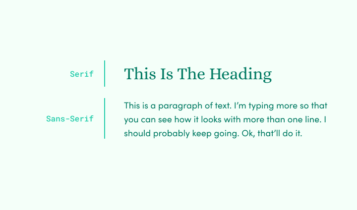
Keep it simple – use one font for headings and another for paragraphs.

It’s perfectly ok to mix serif and sans-serif fonts in this way as long as you do it consistently.
Two Colors
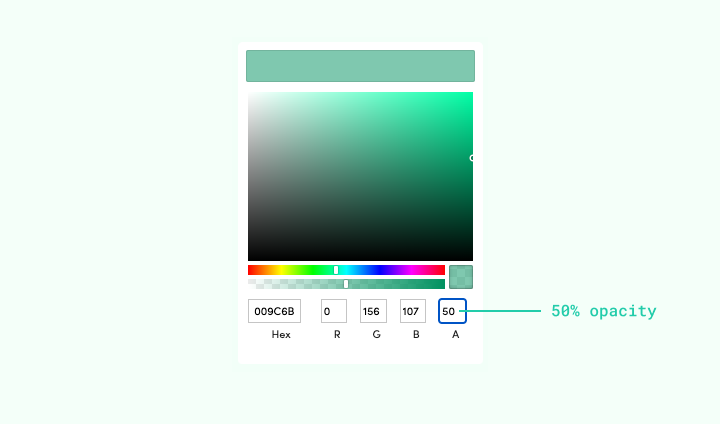
Usually your brand color plus one more that complements it.

A quick trick that works most of the time is to reduce the transparency of your brand color to get the lighter version.
Three Font Sizes
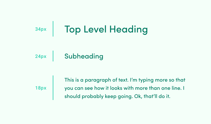
One for headings, one for subheadings and one for paragraphs.

34px, 24px and 18px will work for most lead magnets.
Page Margins
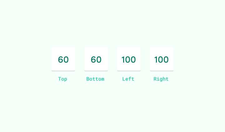
For pages that are mostly text I would recommend a 60px vertical margin and 100px horizontal margin around the content. This gives a nice balance of whitespace and ensures that line lengths are not too long.

Note – other types of page like cover pages, chapter separators and calls to action can have more diverse page margins without affecting the overall visual consistency of the lead magnet.
Bonus – Done For You Service
The tips in this article will go a long way to making your lead magnets looks more professional. But sometimes, no matter how hard you try, you just can’t get your content to look good. That’s when it’s time to call in the professionals.
We’re trying out a new service here at Beacon. For as little as $49 per month you can have us design your lead magnet for you. Just send us the content along with a little information about your company and we’ll take care of the rest.
It means you can forget about things like font sizes and page margins and you can concentrate on your business instead.
Want Us To Design Your Lead Magnets?
If you’re reading this post thinking, “this sounds like a lot of work” then today is your lucky day! We now offer a design service so you don’t have to make your own lead magnets.
Note – this is an introductory price as we test demand for the service. Upgrade your account today and we guarantee no price increases.