
This is How to Write an Irresistible Email Call to Action
Oh, I’m sure you’ll agree with me on this: seeing email stats showing people opening your message and then, completely ignoring the call to action is so heartbreaking.
After all, you’ve put so much effort into crafting that email, hoping to attract subscribers back to the site.
But there’s nothing…
Days pass, and your click-through rate still lingers well below the industry’s average.
However, the chances are that, in spite of doing everything else right, your email call to action just wasn’t strong enough to get your subscribers to click.
Luckily for you, in this post, I’ll show you exactly how to change that.
You’ll learn how to write an irresistible email call to action and boost your click-through rate.
Interested? Let’s take it from the top then.
#1. Reduce the Perceived Cost of Clicking Your Link
Did you know that in many situations, generic buttons like “learn more,” “view details,” or “see it for yourself” would greatly outperform more specific CTA’s, i.e. “shop now,” “view options,” etc.?
Yup.
(BTW, check out these research findings if you don’t believe me.)
And do you know why that is?
Because, as researchers from Marketing Experiments discovered:
“For every call to action in an email, there is an implied psychological calculus cost in the mind of the customer (value vs cost)” (quoted via Vero)
In other words, subscribers weigh the cost of clicking the link vs. the promised value. And they’ll click only on those links where the value greatly outperforms the cost.
And so, to improve the performance of your email call to action, you need to reduce the perceived cost of clicking the link.
Example. Let’s imagine that your goal is to compel someone to visit a product they’ve never heard of before. It’s only natural to suggest they sign up for it. However, given that the person knows nothing about the product, the cost of this action far outweighs the potential benefit. Therefore, you probably stand a greater chance of succeeding if you suggest they “learn more” about it first.
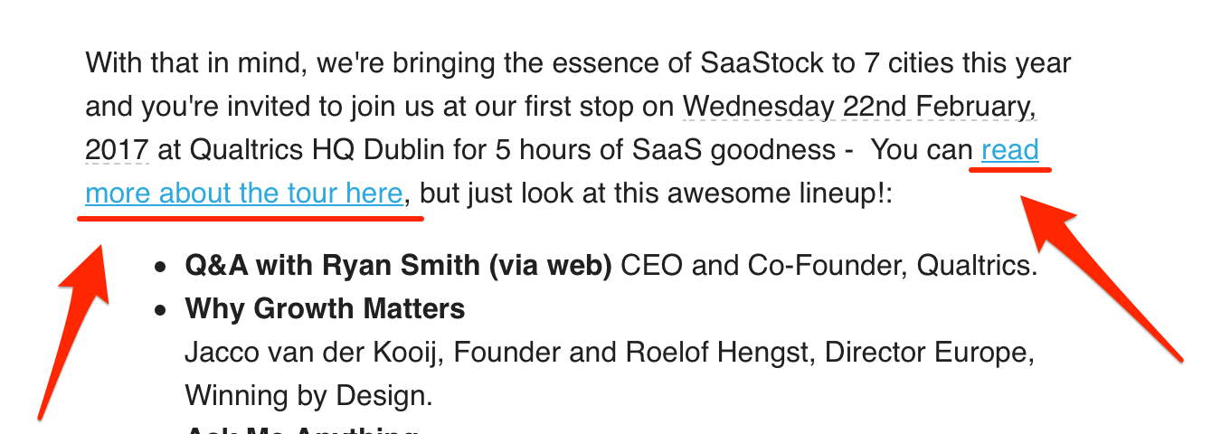
(Folks behind the amazing SaaStock invite email subscribers to read more about their latest event, rather than immediately pushing them to sign up!)
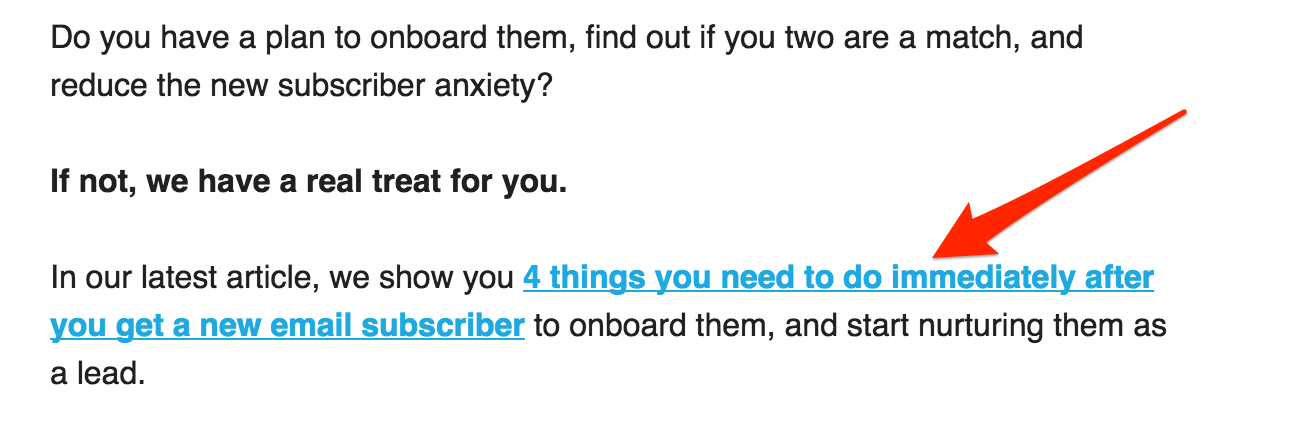
Another example. In this scenario, you want to entice subscribers to visit your blog and read the latest post. You can suggest they simply “read it now.” Or, alternatively, experimenting with making the part of the email that explains the biggest benefit of the content a link. You might see that these links get a much higher CTR. And that’s because, for anyone experiencing the problem your article helps overcome, those benefits would far outweigh the cost of clicking.
#2. Drop Any Friction Words from Your CTAs
Tell me: how likely do you typically enjoy doing things you have to do (particularly, if compared that those that you need to do)?
My guess, not so much.
And yet, as it turns out, quite often we make our subscribers feel forced to take action in the CTA…
How? By using what’s known as friction words.
One of my favorite copywriters, Joanna Wiebe from the amazing CopyHackers, explains friction words as:
“[…] words that describe things people have to do – not things people want to do. They cause cognitive friction. Web copy that converts is focused on what people want to do. “
Furthermore, as she adds (note, the emphasis in bold is mine):
“Most often, friction words are found in calls to action.”

So, what are those friction words? Actually, they are pretty much every action verbs that push a person to take a particular action.
For example, buy, sign up, submit, join, donate…
These verbs make a person feel compelled to do something. It’s as if taking action is no longer their choice but something you impose on them.
As a natural reaction, they respond negatively to those CTAs.
However, phrases like check out, discover, learn to leave the decision to them. When using those verbs, you merely suggest an action. But by all means, you do not force them to take it.
And as a result, you get more people actually clicking them.
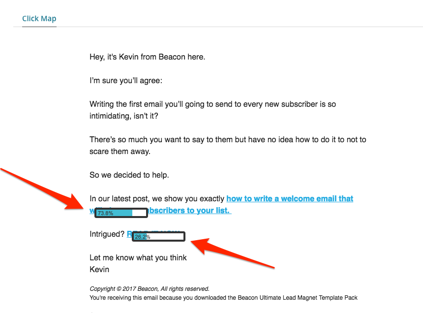
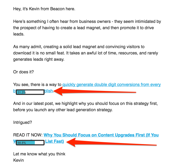
#3. Include More Calls to Action Pointing to the Same Location
Let’s make this clear:
I agree, having multiple calls to action pointing to different locations (e.g. your post, your site, and your signup page) is nothing short but distracting.
But you could include multiple calls to action pointing to the same location (i.e. your article), making it perfectly clear that each of them contains the same link.
For one, more CTA would mean a greater chance for clicks.
Plus, we’ve noticed that while many people prefer to click the benefit-driven call to action, there are still some who respond better to a more traditional button that features an action verb:
#4. Test Graphic Button Instead of a Text Link (or Vice Versa)
When it comes to email marketing, there is one simple truth that I work by:
Every audience is different.
Although the majority of our clients’ subscribers respond to certain strategies, to engage the others, we need to completely change the way we do things.
And that relates to email calls to action too.
For example, we use text links in most of the campaigns we create. However, for some selected clients, we’ve discovered that actual buttons perform better.
In spite of our best efforts, these audiences just refused to click a text-based link.
But when we tried the same strategy on others, it turns out that button performs ridiculously low for them.
And so, test different types of CTAs to establish what type engages your audience the most.
(Note: When doing so, you should still follow some of the other advice from this post – reduce the cost of clicking, and skip friction words – to write the most compelling email call to action.)