
How To Boost Lead Form Conversions Like A Boss (Backed by Research)
Tell me, are you currently struggling to generate leads?
Wondering why, in spite of having a killer landing page, an engaging headline, and an irresistible call to action, you still can’t convince visitors to sign up for your list?
Well, the problem might be your lead capture form.
And in this post, I’ll show you how to boost your lead form conversions by making only a couple of simple tweaks.
Ready? Then let’s do it.
#1. Move the Form Closer to the Fold
There’s an ongoing debate about whether placing various page elements above the fold affects their performance.
And true, when it comes to calls to action, like buttons, for instance, the research tends to confirm that placement doesn’t matter.
However, the situation changes when you’re trying to boost email form completions. Then, showing it to a visitor when they’re the most engaged with your content is beyond crucial.
And here’s what marketers often get wrong:
They assume that anything placed on top of the page (or above the fold) gets immediate attention.
But many people begin scrolling right away. Chartbeat discovered that only 70% of visitors see the top of the page.
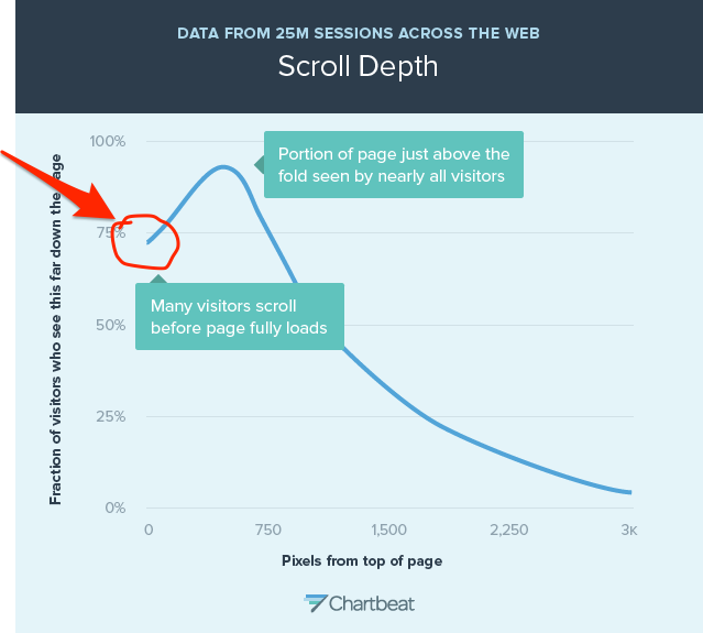
However, nearly all of them see the area close to the fold!
Here, take a look at the graph again:

Incredible, right?
These findings suggest that placing the most important elements close to the fold will actually improve their visibility and performance!
Google discovered similar pattern when assessing the visibility of ads on a web page. According to the research summary published in Wall Street Journal:
“Perhaps counterintuitively, the most “viewable” ads were not placed at the top of publisher pages, but were actually located directly “above-the-fold,” at the bottom of the visible part of a webpage immediately after it loaded.”
David Oglivy famously also said (note: emphasis in bold is mine):
“Research shows that readership falls off very rapidly up to 50 words of copy, but drops very little between 50 and 500 words.”
And as Bnonn Tennant points in his article on Kissmetrics:
“That’s a rather important insight because 500 words of copy, set at 16px or above at the optimal 75 character measure and 150% line-height, will take up at least 1,000 pixels of vertical space.”
In other words, it falls around the fold!
So, as the first tweak, consider moving or placing your form closer to the fold – the bottom part of the screen, visible without scrolling.
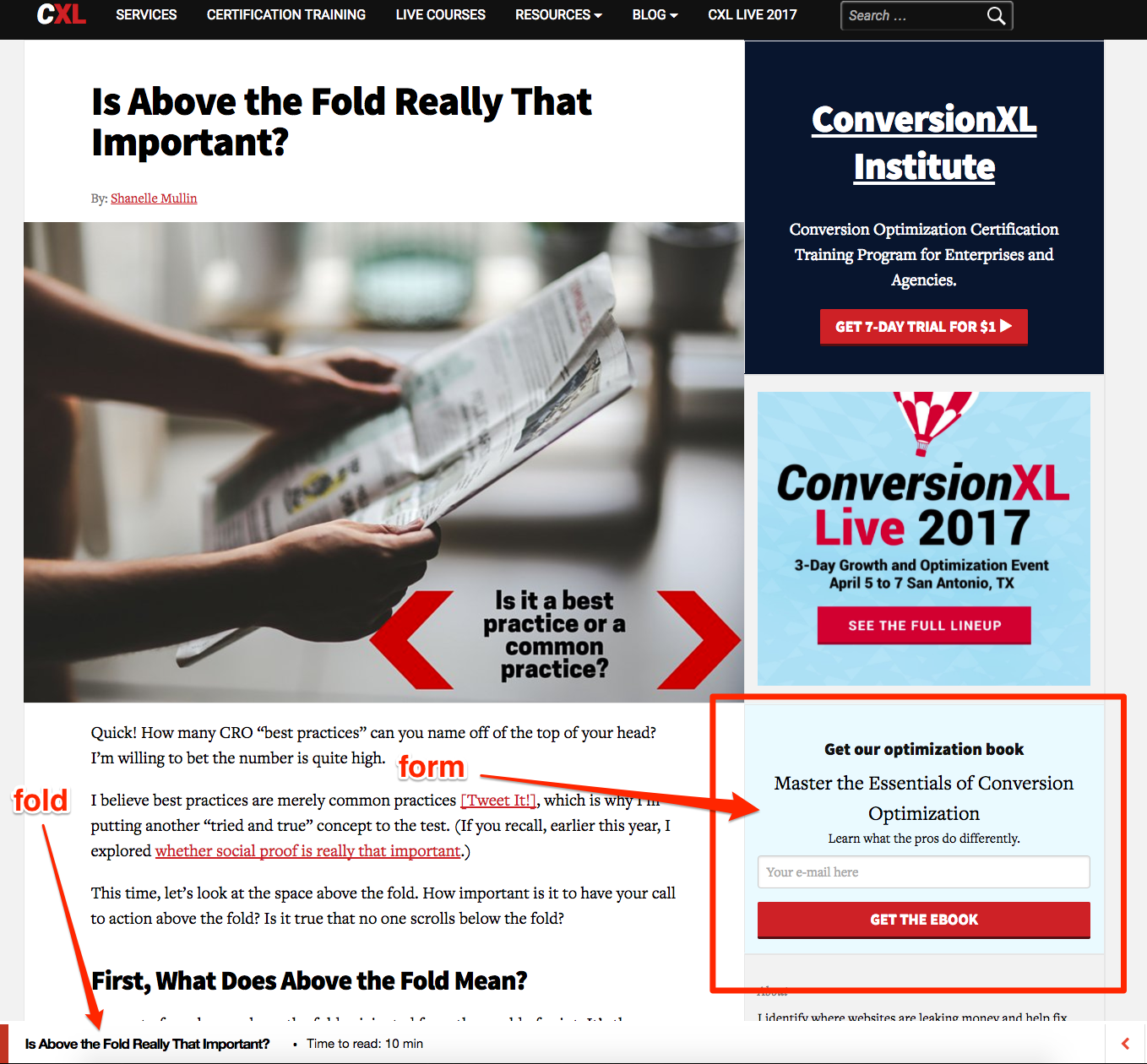
Not convinced? Then take a look at where ConversionXL, undoubtedly the most knowledgeable folk when it comes to conversions, place their signup form on their blog:
#2. Convince Visitors that the Form is Secure
This goes without saying, right?
Unless your visitors feel secure about submitting sensitive information on your site, well, they simply won’t do it.
Just the sheer anxiety of a possibility of being bombarded with unrelated marketing emails is enough to deter anyone from signing up.
And so, you need to convince your visitors that they can trust you.
One way to achieve it is by including a link to your privacy policy page if you have one.
Alternatively, include a short privacy policy statement on the form itself.
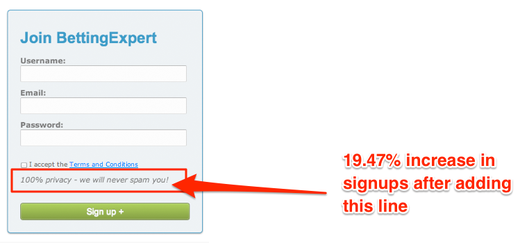
You don’t have to create anything lengthy. As it turns out, adding even a single sentence policy could increase conversions up to nearly 20% (as in the case of Betting Experts).
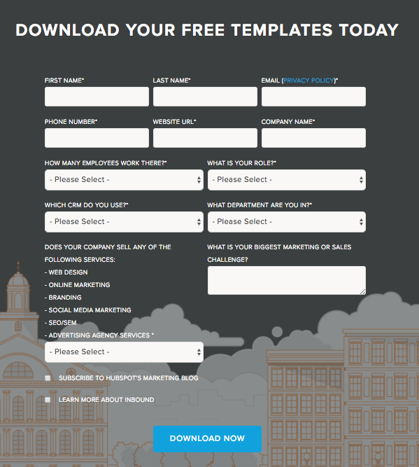
#3. Design Your Form to Seem Shorter
If your form collects only a small amount of information, an email, and name, for instance, then you don’t have to worry about its layout.
But when you create lead capture forms that also help pre-qualify leads, then HOW your form looks becomes as important as WHERE you place it.
Because let’s face it:
Most of us hate filling in anything long.
After all, submitting 1 – 2 fields requires no effort. But completing a form like this one… now that’s another story:
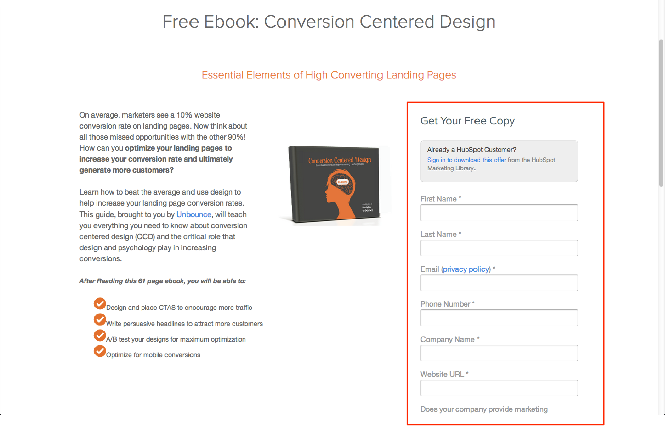
But let me make this clear – there’s nothing wrong with that landing page. It’s just its length might cause friction among visitors.
As Sarah Goliger points in her Hubspot piece:
“If the form is too long, prospects are going to stop and evaluate whether it is worth their time to complete all of those fields.”
But what if you need to include all those fields in a form?
The solution is actually quite simple – make it to visually seem shorter.
Here are a couple of ideas how:
Place relevant form fields beside each other.
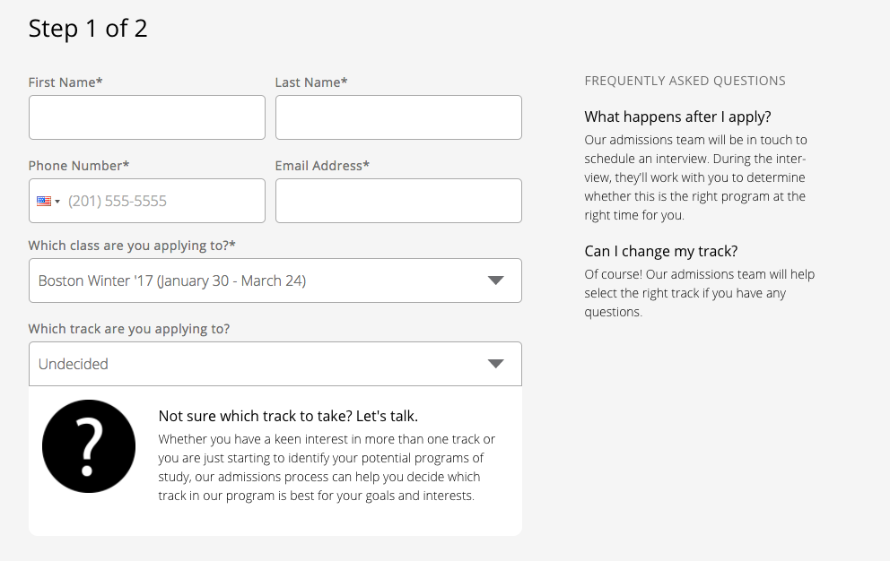
I’ve already shown you an example of a long form from Hubspot. But now, take a look at how the company formats the same forms now:
See the difference? It’s an equally long form. But by placing fields in rows, Hubspot manages to make it seem much shorter.
Make (and mark) certain fields as optional
Even if you need to ask for all the information on a form, it doesn’t mean that prospects couldn’t complete it without providing only some of it.
And allowing them to choose which fields to fill in and what information to skip will most likely make the form much simpler to complete.
Use pagination
I admit, it wouldn’t be my favorite approach to solving this problem. However, it’s an option you could consider, and so, I include it here.
When creating a long form, you could consider breaking it into two separate sections, with only the current one visible on a screen.
Of course, the fact that there are more than one form screens to fill in might deter a person from continuing. But at least, at first glance, the form will seem shorter.
(source)
#4. Place Social Proof in Proximity of the Form
Last year, when explaining the concept of social proof, I wrote:
“We humans are pack animals. Sure, you might think that you’re an individual creature but deep within you’re as influenced by other people around you, their opinions, choices, actions as anybody else.
We all exhibit what Friedrich Nietzsche called the Herd Morality – “lacking any individual will and living by group instincts” (source).”
I admit, these words might sound harsh.
But unfortunately, they’re also so true.
Just take a look at some of the conformity experiments that proved it:
[embed: https://youtu.be/TYIh4MkcfJA] [embed: https://youtu.be/9n5shmX_eiM](Note, if you’re interested in the topic, I list many other research findings in my guide to social proof here)
One thing that comes out of these experiments is that we typically assume that if many people are doing or have done something, then there must be a good reason for that.
And so, we choose to imitate their actions.
Now, my purpose of writing this isn’t to scare you but highlight an important aspect of making your lead capture forms more effective – the need for proof that others have already believed in what you do.
And the good news is, that’s very easy to do:
Include any social proof somewhere close to the form so that anyone considering signing up will see it.
Here are a couple of suggestions how to do it:
Place testimonials in a proximity of the form. You don’t have to make them a part of the actual form. However, a visitor should be able to see them while reviewing the form.
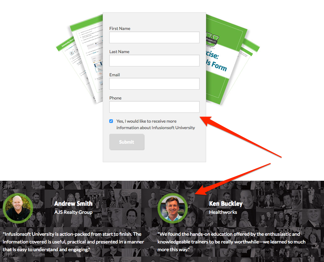
(Source)
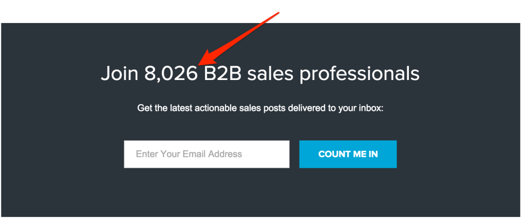
Include actual stats, like a number of subscribers on your list on the actual form.
Using Lead Magnets to Generate Leads for Your Business? Click here to learn how Beacon could help you create and launch them in minutes.