
How to Boost Email Signups by Removing These 4 Conversion Killers
It’s so frustrating, isn’t it? You’ve tried literarily everything – improving calls to action, writing killer headlines, and promoting the h**l out of your lead magnets too.
And yet, visitors still refuse to sign up to your email list.
But you know, the chances are that your site includes conversion killers that deter visitors from even noticing your lead magnet.
And in this post, you’ll discover what the 4 most common conversion killers are and how to remove them from your site.
Intrigued? Just keep on reading.
But First Things First, What Exactly Are Conversion Killers?
The term conversion killers typically refer to design and usability elements that obstruct a person’s journey to conversion on a page.
Some people refer to conversion killers as mistakes. Personally, however, I attribute their negative impact to a difference between what YOU believe visitors expect on a page, and what THEY want to see there.
Here, let me show you. Take a look at the visual below showing how other elements might drive visitors away from the call to action (Note, I marked the CTA in yellow on the left image. I colored distracting elements with red, yellow and dark gray on the other one). 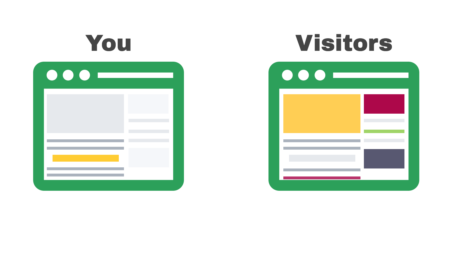
Another crucial aspect of conversion killers, as you’ll shortly see, is that they often seem small or insignificant.
Yet their impact on lead generation, email signups or online sales is incredible.
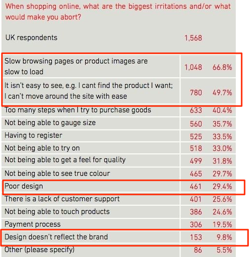
For example, take a look at these survey findings (via Econsultancy). See how many of the reasons for abandoning websites relate to site design and usability.
(And I know, these stats relate to online shopping, not lead generation. But I believe that the principle behind our behavior is the same in both situations. If something confuses us or obstructs our journey to conversion, we abandon the site. Simply.)
So, what are the most common conversion killers that might be deterring visitors from signing up on your site?
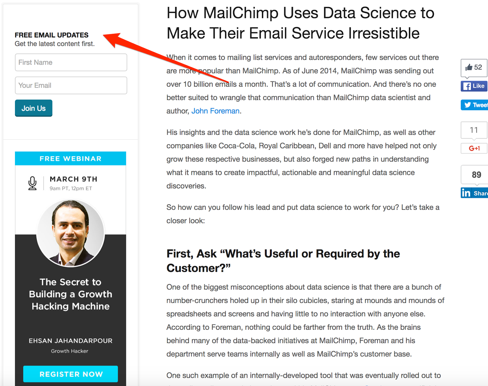
#1. Featuring Too Many Elements That Cause Visual Confusion
Look, it’s a known fact:
We rarely actually read the pages we visit.
In fact, according to research by Nielsen Group, many visitors consume no more than 18% of a web page. And 17% of readers will view it for no longer than 4.4 seconds!
Crazy, huh?
But what this means for you is that although visitors might be interested in your page, they’ll most likely only skim it.
And what goes with it, they will get distracted by too many elements on a page, particularly if they’re close to each other.
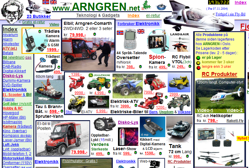
I admit, the below is an extreme example, but I’m sure it clearly explains what I mean.
How to fix this:
- Reduce the number of elements on a page. Consider what you really need to show your visitors and remove the rest. (Note: I interviewed Alex Birkett from ConversionXL about identifying conversion killers in a blog design. You can listen to our chat here).
- Also, move elements away from each other to create space and visual hierarchy.
- Finally, place calls to action where visitors are the most likely to spot them.
This last point in the list above is especially important, and brings us to the next conversion killer:
#2. Placing CTA Where Users Wouldn’t Look
You see – most visitors will skim the page using one of the various reading patterns.
They’ll pay attention to specific areas of the page and completely ignore the others.
And so, if you place calls to action or even any mentions of the lead magnet in areas of little focus, visitors might skip them, and never even realize your offer.
The most common of reading patterns is a Gutenberg Diagram, also known as the Z-Pattern. It looks like this:
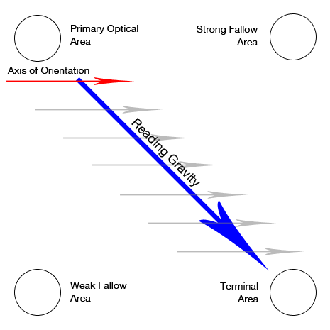
Note that it divides the page into four sections, according to a person’s focus to elements in that area.
As Steve Bradley amazingly describes it in this piece:
“The pattern suggests that the eye will sweep across and down the page in a series of horizontal movements called axes of orientation. Each sweep starts a little further from the left edge and moves a little closer to the right edge. The overall movement is for the eye to travel from the primary area to the terminal area and this path is referred to as reading gravity.”
And so, by moving information about your lead magnet and call to action to the strongest areas on the reading gravity path, you can significantly increase chances of a person noticing it.
For example, Kissmetrics reversed the conventional blog design, moving the sidebar to the left. As a result, their calls to action now sit in the Primary Optical Area.
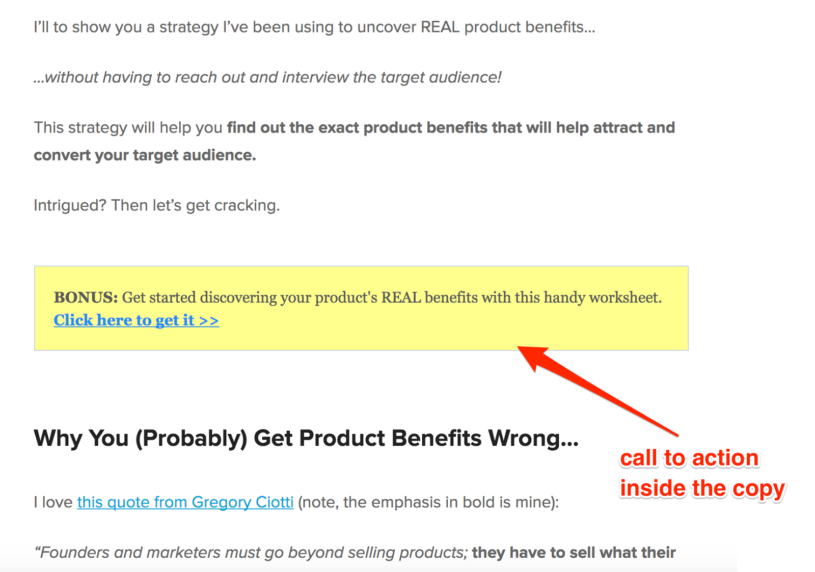
The other option is to disrupt your visitor’s scanning pattern. For example, Attach reduced page elements to a single column, pretty much preventing a person from skimming the page with a Z-Pattern.
Instead, a visitor can only scan the page by scrolling down, and as a result, can’t miss big calls to action placed on their journey.
(link to the post with this call to action)
#3. Offering Unreliable Social Proof
Fact: Most new visitors need to see some form of proof from you before they sign up to your list.
They want to know if you’re providing valuable advice or information, and aren’t going to use their email purely to spam the hell out of their inbox.
Simply.
And what’s the best way to communicate your trustworthiness?
You got it, by offering social proof – a testimonial, case study, client quote or anything else verifying that other people have successfully availed of your offer.
But here’s the trick – not every testimonial or client quote will help you convince visitors to sign up.
In fact, some might actually drive them away, particularly if you present false or unreliable proof.
Here are some examples:
- Claiming to have high numbers of subscribers on a blog with only a couple of articles. Although achieving such success is possible, most new visitors will look at such statistics with disbelief.
- Showing anonymous testimonials or featuring generic stock images. Displaying quotes signed with labels such as “Happy User” or “Customer” might seem like a good idea. In truth, however, it only screams fake (even if the quote is actually real, and you simply can’t disclose the customer’s name).
- Making unrealistic claims about your successes. Let’s face it, improving someone’s traffic by 12000% sounds mind blowing. But is it realistic? Probably not. On the other hand, boosting email signups by 35% seems totally legit.
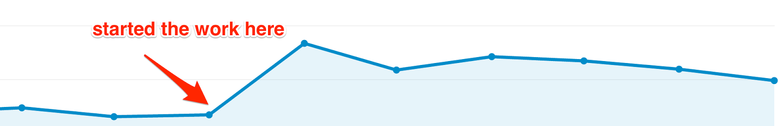
- Showing screenshots out of context, like the below Google Analytics charts without time range and metrics. I admit it could suggest great success – until I told you the metrics it displays and the time range. (And to be honest, this report has nothing to do with metrics I’d normally report on. Plus, it shows growth over a very long time.)
#4. Displaying a Threatening Privacy Policy
You know:
Back in 2014, 36% of internet buyers listed identity fraud as one of their top concerns online.
And I’m sure today that number if much much higher.
After all, how often do you quickly check if a company has a privacy policy? You may not read the whole thing. But I’m sure simply knowing that they have one is comforting.
But does every privacy policy reassures customers?
As it turns out, no. In fact, the way you phrase your policy can either convince or discourage someone from signing up.
Here, let me show you an example (via VWO.com). Back in 2014, TheSolutionforDiabates.com ran a simple A/B test in which they added a privacy policy, reading “We respect your privacy” to their lead magnet call to action.

And the result was a staggering 24% ….drop in conversions!
Incredible, right?
But let’s take a closer look at the privacy policy. As VWO points:
“[…] the text had a counteractive effect as it instilled the seeds of distrust and worry in the minds of visitors.”
And according to Martin Malmberg, the owner of TheSolutionforDiabates.com (cited via VWO) [note, the emphasis in bold is mine]:
“I guess people started to worry about spam and privacy concerns after reading such a text. Whereas, the thought doesn’t even enter their heads without that text.”
What’s the lesson here? Consider how you phrase your privacy policy. Keep it as simple as possible, and ideally focus on telling visitors that you have a policy, rather than what it means for them.
Want to boost your email signups? Check out how Beacon could help you publish engaging lead magnets in minutes.